The Equilibrium, Volume III

THE BACKGROUND

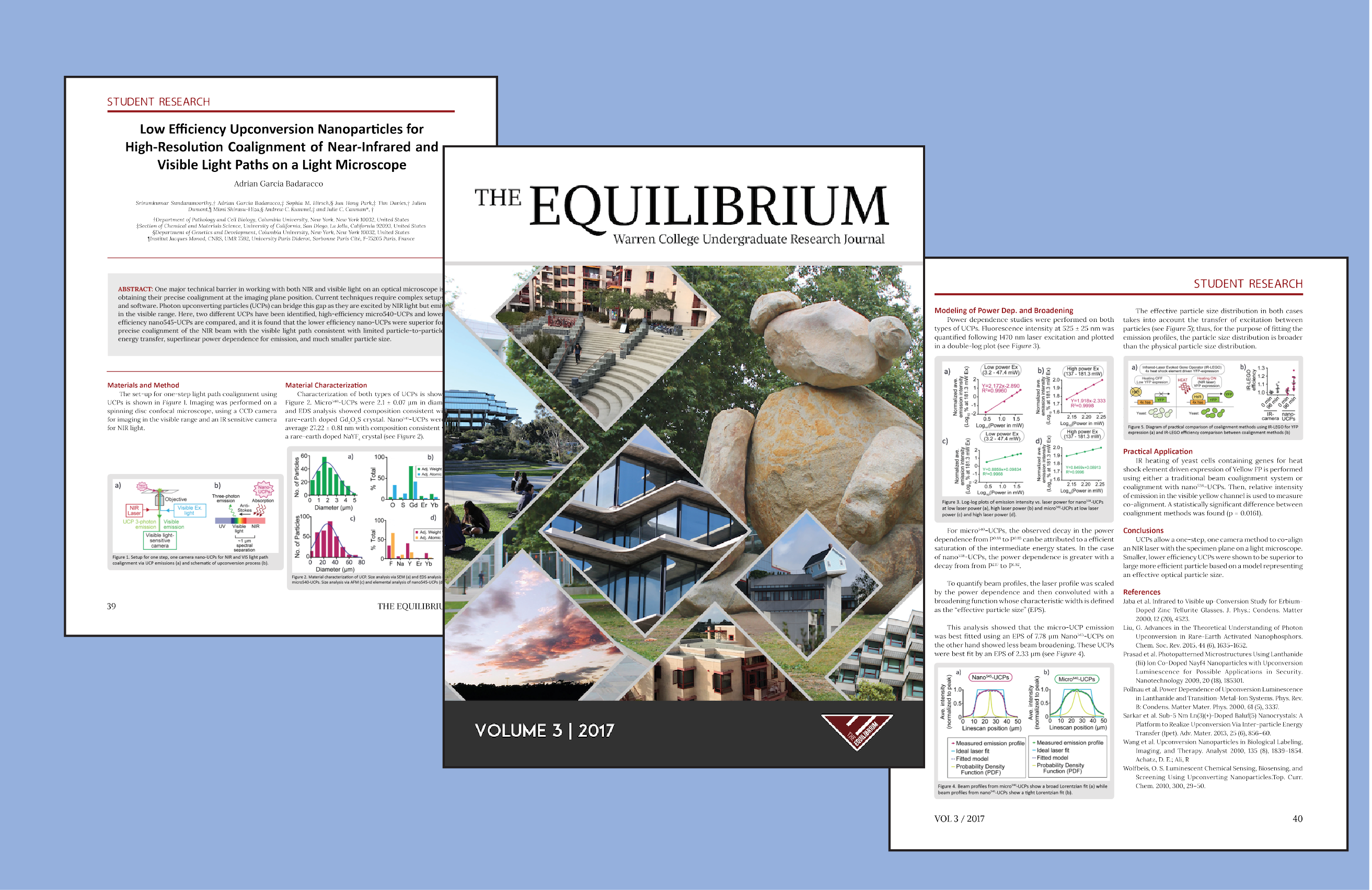
Designing an interdisciplinary research journal that features research done by undergraduates of Earl Warren College at UC San Diego.

The Equilibrium is a student organization that annually publishes a research journal filled with research done by undergraduates in the Earl Warren college. This project covers the design work done for the third edition of the journal, published in summer of 2017.

THE TEAM

I was the main design editor on the team and worked with the larger organization of journal editors for feedback and coordination of content.

THE METHODOLOGY & TOOLS

I utilized Adobe InDesign to create the cover and page designs, and I used competitve analysis and user interviews methodologies to gather data.
The Problem & Opportunity

The Equilibrium is a relatively new organization, and because of this, branding and design has been inconsistent and experimental. For this issue, we wanted to make the journal more professional, coherent, and consistent. Since The Equilibrium is an interdisciplinary research journal, a particular challenge was presented: How do we create an effective page layout that clearly showcases, represents, and supports all types of research, regardless of the research field.

User Interviews

In order to gauge what features users enjoyed or were confused by, user interviews were conducted. Questions were asked to evaluate the effectiveness of a design choice. Questions included, but were not limited to: "What is your initial response to the journal?" "Were there moments/pages where you found it hard to read/understand?" "What is one aspect that you would improve?"

I used these interviews to frame and contextualize the design choices for the new issue of the journal. From the interviews, I gathered that a major challege was creating a uniform presentation, especially within the a single journal issue itself. Major points were to standardize the page frames, color used, and page layouts for easier readability.

1. Overall Design is Inconsistent

Between volumes, design changes didn't quite make sense. Overall journal design should be consistent.

"Flipping through the pages, I didn't like how there wasn't any consistency among sections. I think most major publications have a similar style/theme for "Professor Spotlight" vs. "Student Research"."

2. Section Design is Consistent

Within specific sections of the journal (student research, professor spotlights, etc.), the design is consistent and easy to read.

"I really love the color scheme and font colors on the 'Professor Spotlight' section - the consistent color of the professor name and questions makes it super easy."

3. Take care of small details

For a more polished look, make the pages cleaner. For example, text justification, figure placement, text size, titles, etc.

"I sometimes feel that there is something missing and/or not done. When I think of a research journal, I think of clean, professional, academic."

4. Improve journal branding

The journal doesn't have much branding beyond the maroon color. This is an opportunity to make the journal stronger as an organization.

"Branding could be done to make the journal presence and image stronger. Right now, it could just be any academic journal."

Competitive Analysis

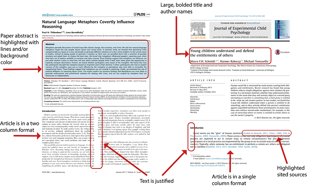
To create a professional journal layout, I examined current scientific journal layout designs.

Similarities

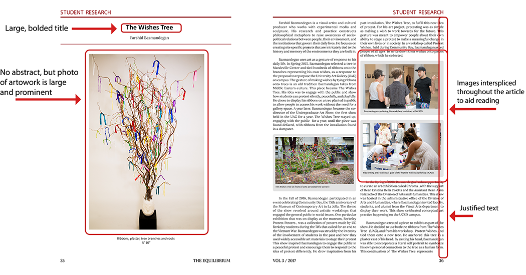
  • Large, bolded article titles and author names appear at the top of the page
  • Titles and names are highlighted by larger font and/or bolded
  • The abstract is highlighted/segmented to draw attention to it
  • Justified text is used throughout

Differences

  • One column layout vs two column layout
  • Serif font vs sans-serif font
  • Prominent journal name vs not
  • Highlighted in-text citations vs regular text
  • Usage of footnotes vs not

Analysis of Previous Issues

In order to improve the journal, we had to understand where the journal currently stood. What was working? What could be improved? Based on the user interviews, we wanted to improve the branding of journals, create a more consistent layout between journal issues and within sections of a single issue, and make sure small details were attended to.


1. Branding

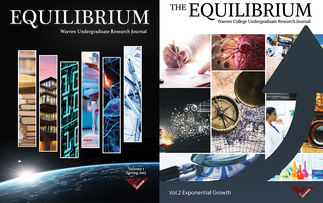
Below are the covers of the first two issues. We decided to tackle the branding challenge with the cover of the journal issue because the cover is the first thing that people see. Creating a consistent layout and cover will allow users to immediately see that the journal is The Equilibrium without really reading it.

Similarities

  • Large, bolded article titles and author names appear at the top of the page
  • Titles and names are highlighted by larger font and/or bolded
  • The abstract is highlighted/segmented to draw attention to it
  • Justified text is used throughout

Differences

  • One column layout vs two column layout
  • Serif font vs sans-serif font
  • Prominent journal name vs not
  • Highlighted in-text citations vs regular text
  • Usage of footnotes vs not

2. Inconsistencies

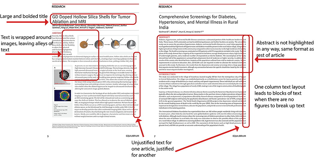
Below, are examples of inconsistencies that we wanted identified in the 2016 issue. We wanted to get rid of these small inconsistencies in order to create a more clean, professional look. At the same time, we wanted to integrate design choices that we identified in the competitive analyses.

Prototyping

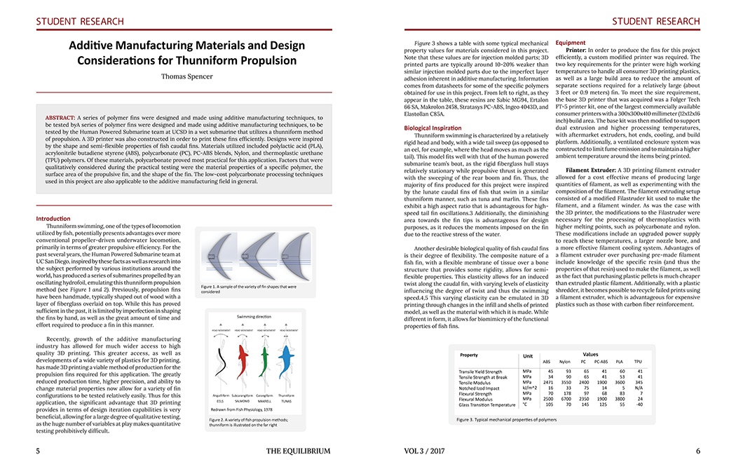
Because the journal is interdisciplinary, we had to adapt page designs to suit different types of research. For example, the 2017 issue contains research from the engineering, economics, and visual arts research pages.


Standard Resarch Layouts:

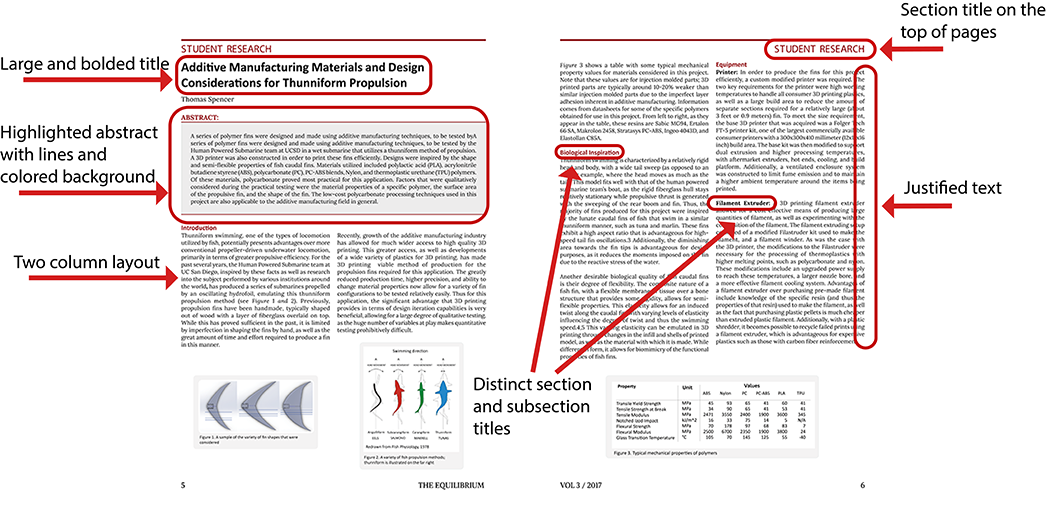
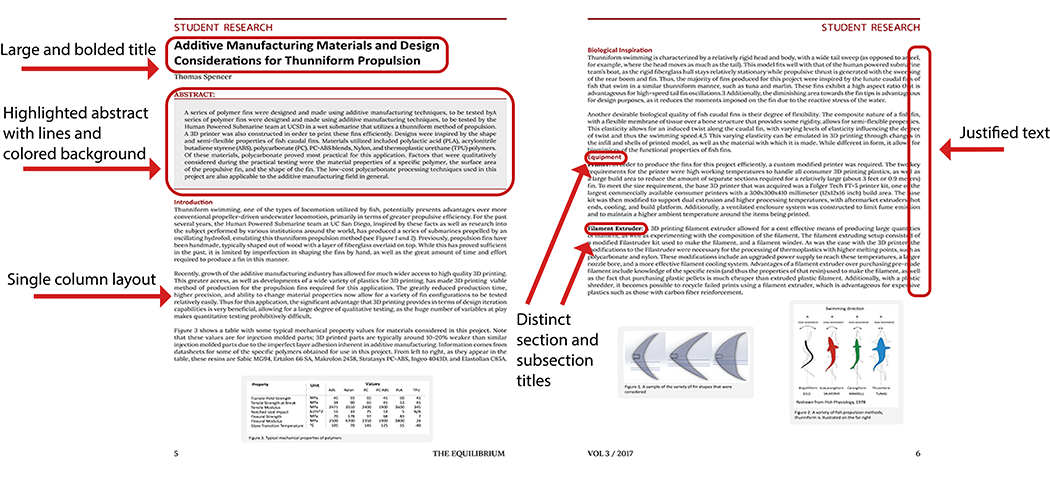
These two iterations have different characterisitcs, but also have similar characteristics that were based on the competitive analysis that was previously done.


Visual Arts Research Layouts:

These two iterations have different characterisitcs, but also have similar characteristics that were based on the competitive analysis that was previously done.

Final Design

After several iterations, I selected design choices that communicated a professional, clean research journal. At the same time, I wanted to create a layout that was accessible to a wide range of possible readers.

Finding a clean design that was versatile and able to accomodate different types of research was particularly challenging and interesting. Since some research submissions are more visual based (photos, graphs, and tables), the layout had to be able to include essential figures while also be adaptable to those that did not have many figures. Choosing the two column format allowed images to be interspersed within the text and provided visual detail that preemptively prevents articles from becoming large blocks of text. Click the link below to see the full journal!


Check out my other work!

Cover photo for Podcasters NPR Dashboard project

ATM V1

PRODUCT DESIGN & USER RESERACH

Building a standalone tool for NPR podcasdt producers to tag theri episodes for sponsorship messages.

Cover photo for ATM V2 project

ATM V2

PRODUCT DESIGN

Updating ATM to automatically update baked-in sponsorship to dynamic sponsorship.

Cover photo for Feed Ingest Service Discovery project

Feed Ingest Service Product Discovery

RESERACH & SERVICE DESIGN

Driving a discovery initiative to define how NPR manages third-party and local station podcasts for NPR platforms.