Planet Money Summer School 2020 Landing Page

THE BACKGROUND

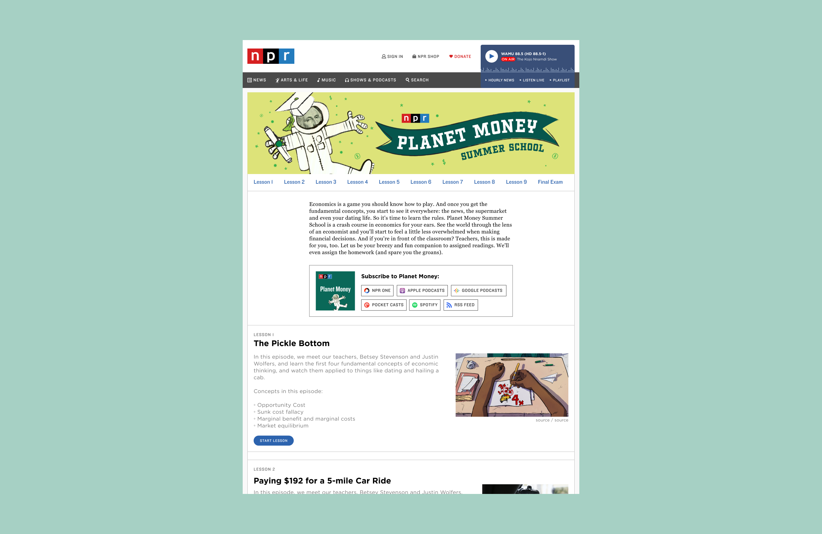
A bespoke landing page for a special series in the summer 2020 for the Planet Money Podcast.

The Planet Money podcast planned to run a series of 10 episodes that were thematically tied together and branded as the "Summer School" series. Since it was intended to be a somewhat stand alone experience, separate from the traditional Planet Money RSS feed, the production team wanted a special landing page.

THE TEAM

I worked closely with the product manager who was managing the request coming from the production team and a lead producer from the podcast.

THE METHODOLOGY & TOOLS

I was both the designer and developer of the landing page. For design work, I utilized Figma to create mockups and prototypes. For development work, I utilized HTML, CSS.

The Problem & Opportunity

The Planet Money production team had an idea to run a “summer school” series. This series consisted of 10 episodes (aka "lessons") that combined old Planet Money episodes and with new interviews and an “online final exam” (aka a tongue-in-cheek quiz” that provided students/listeners with a “diploma” after completion).

Since this was a special, limited run series, the Planet Money production team wanted a new, separate landing page that could be reached using a direct link that was separate from the show’s usual podcast show page. In this project, I was the sole designer of the page and developer for bespoke HTML embeds and CSS overrides. This project timeline was only a month long, with a hard launch date of July 8, 2020. During this time, I worked with a product manager, a podcast analyst, and Planet Money’s lead producer.
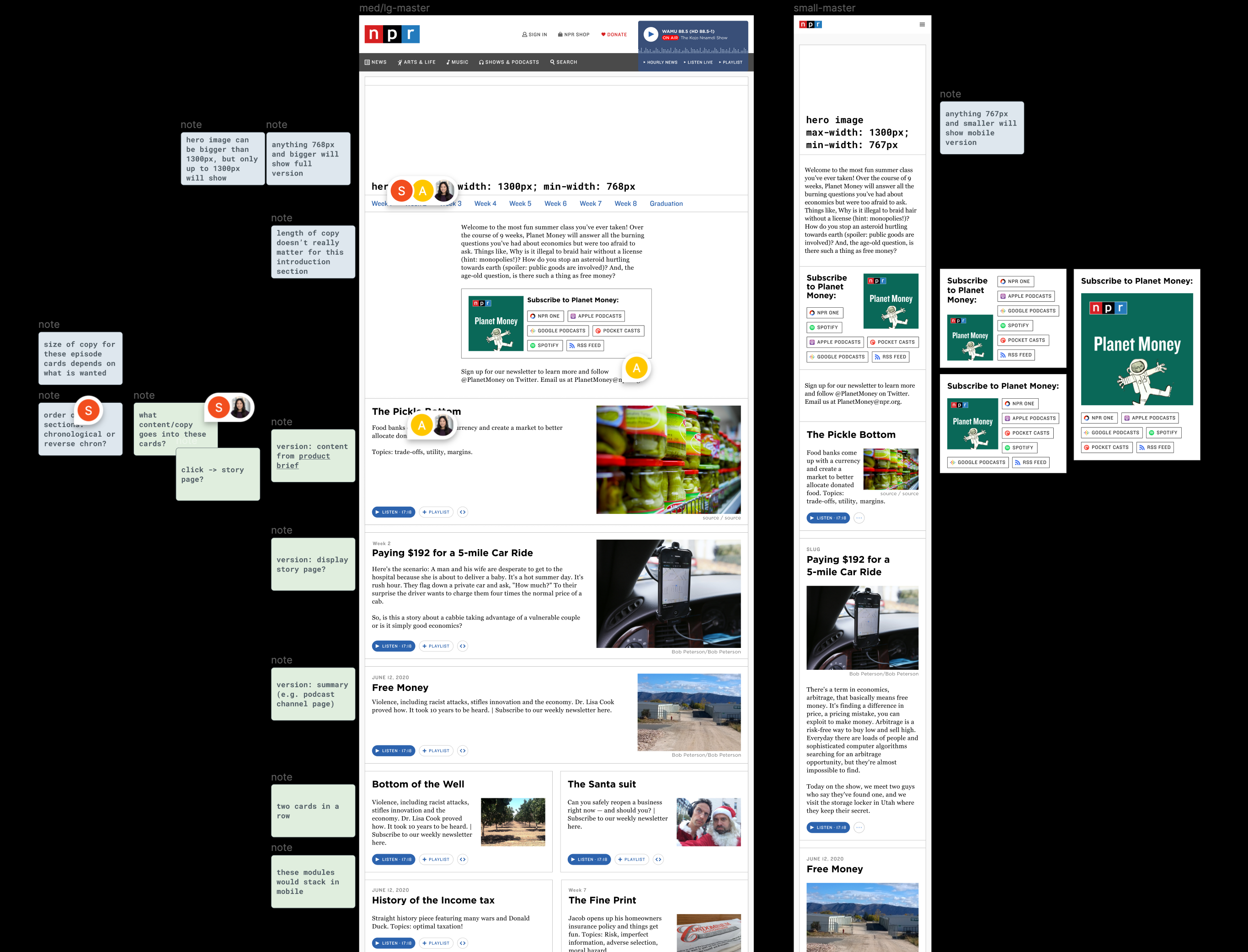
Design

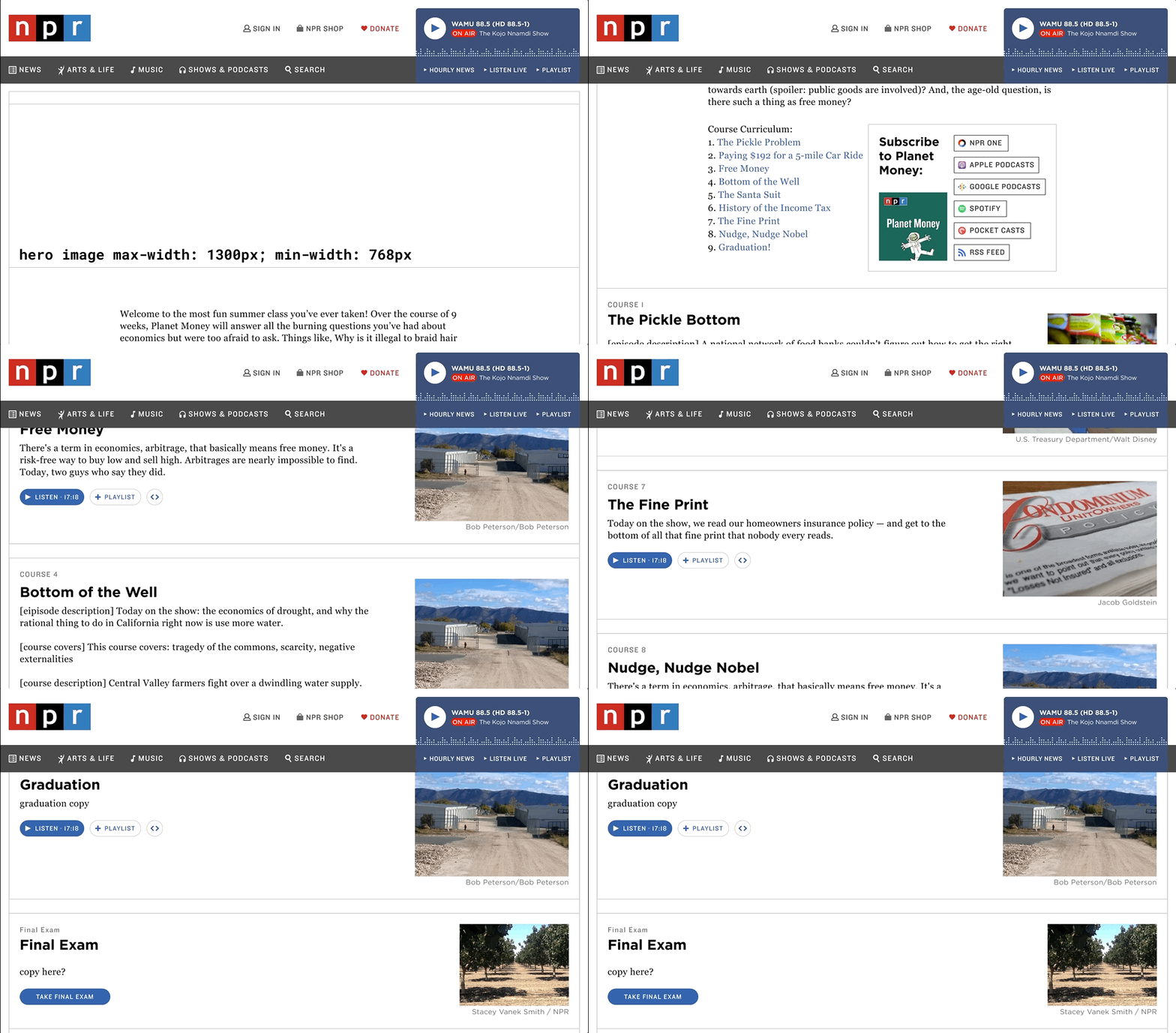
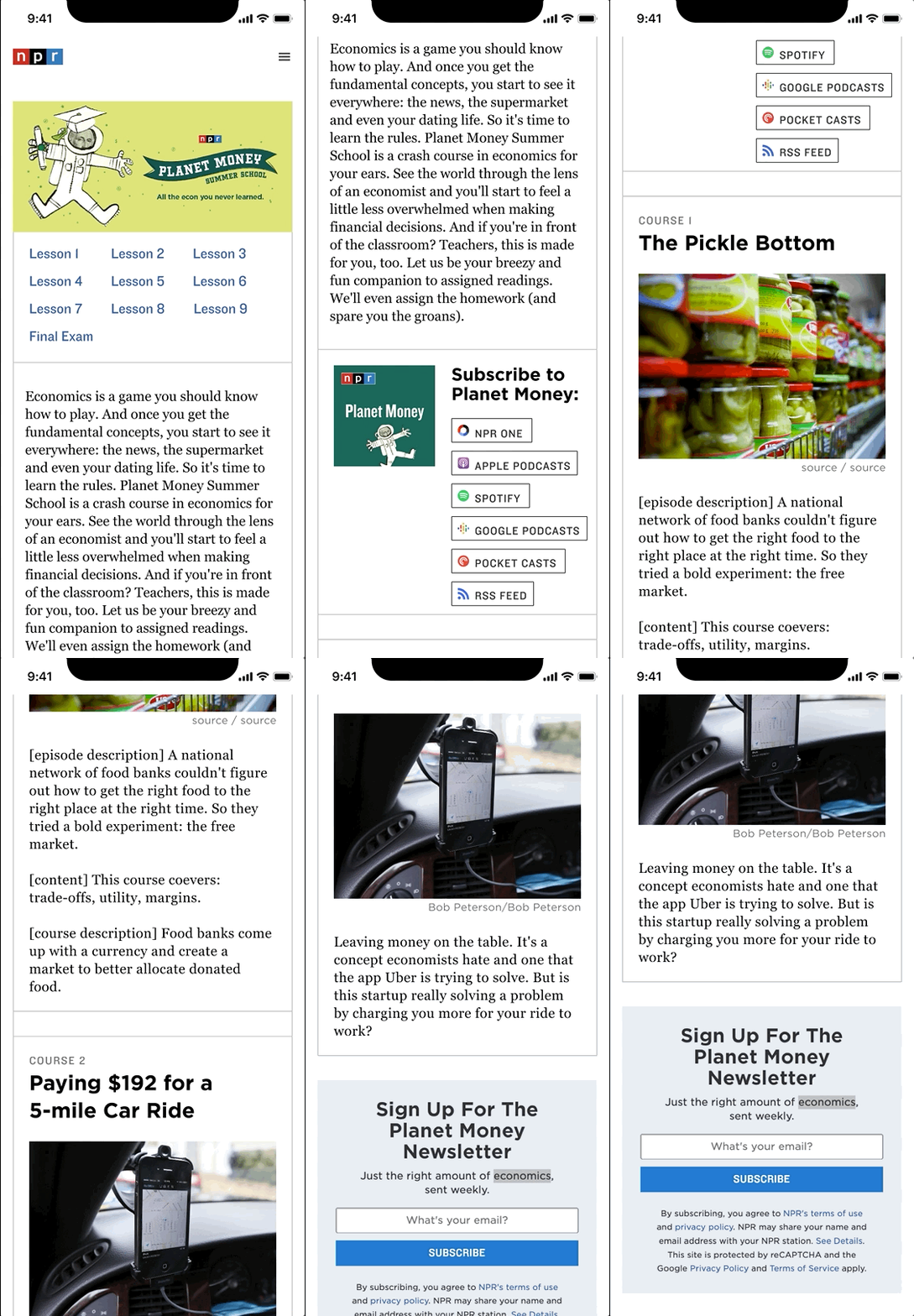
I first started with high-fidelity wireframes. I started with high-fidelity wireframes because the the landing page would utilize the overarching styles for the npr.org website. Thus, I only needed to consider how specific requirements for the series would display and how the designs would account for the full width of the page. (At the time, podcast episode pages only took up 2/3 of the width.) I considered both web and mobile experiences, as listeners could visit this landing page both on desktop browsers and directly on their phone, which is where most people listen to their podcasts.

I showed these designs to other designers on the design team and the product manager, podcast analyst, and show’s lead producers to get feedback. Two updates were made:

Full-width Design

There were two designs for desktop: one column (where each episode card would span across the full width of the page) and two column (where two episode cards would show in a row, which spans across the full width of the page). Ultimately, the one column design was selected so that each episode card could accommodate more and stylized text.

Subscription Button Options

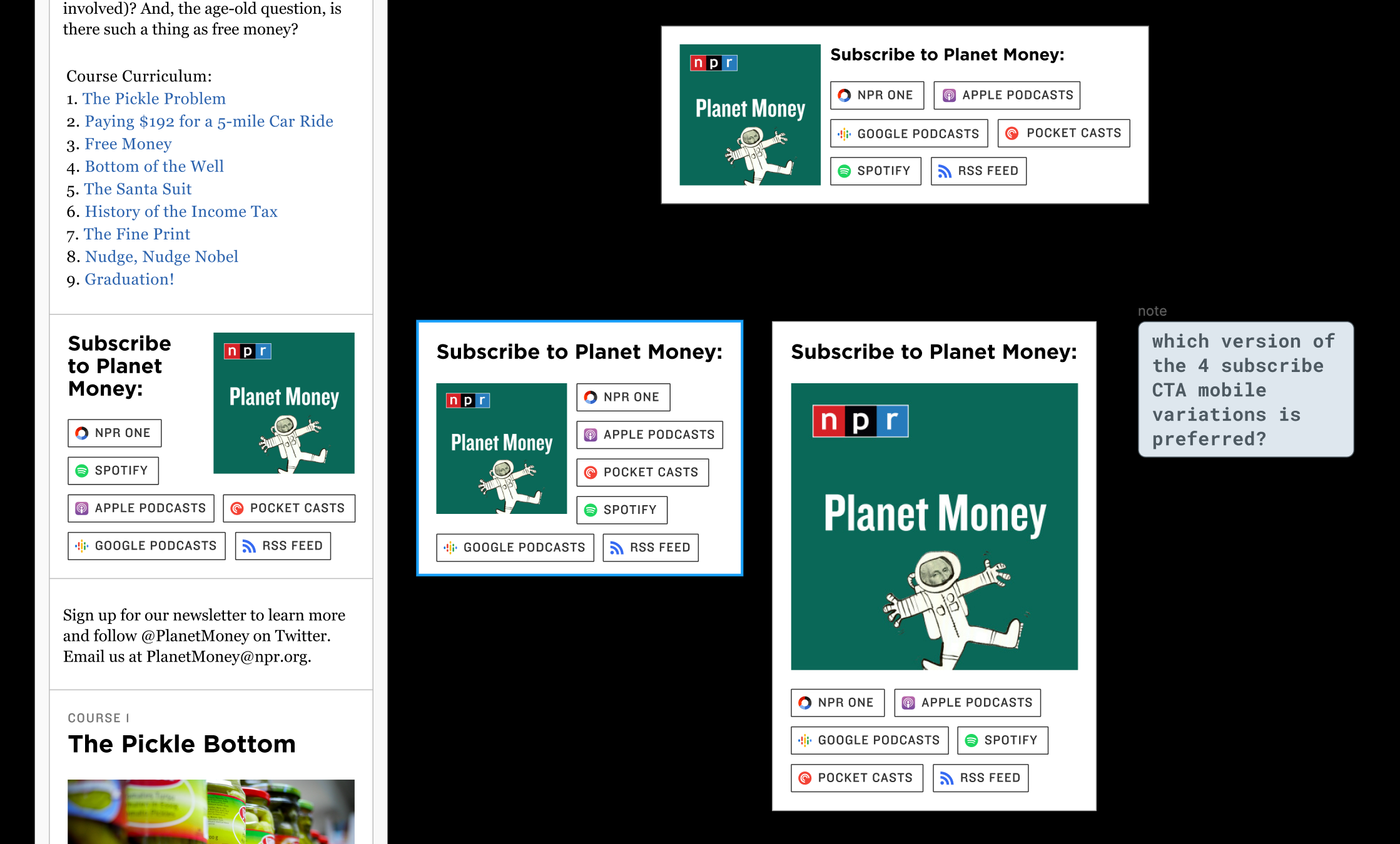
I provided several options for the "Subscribe to Planet Money" call to action for mobile: the production team decided that they wanted all the platform buttons to be left aligned on the right-hand side with the tile art occupying the left-hand side. They felt the wrap versions I provided were less conducive to quick scanning to find the right platform, and they wanted the tile art to not occupy the full width of the mobile view.

Design

Web

Web and mobile experiences were simultaneously created.

Mobile

Implementation

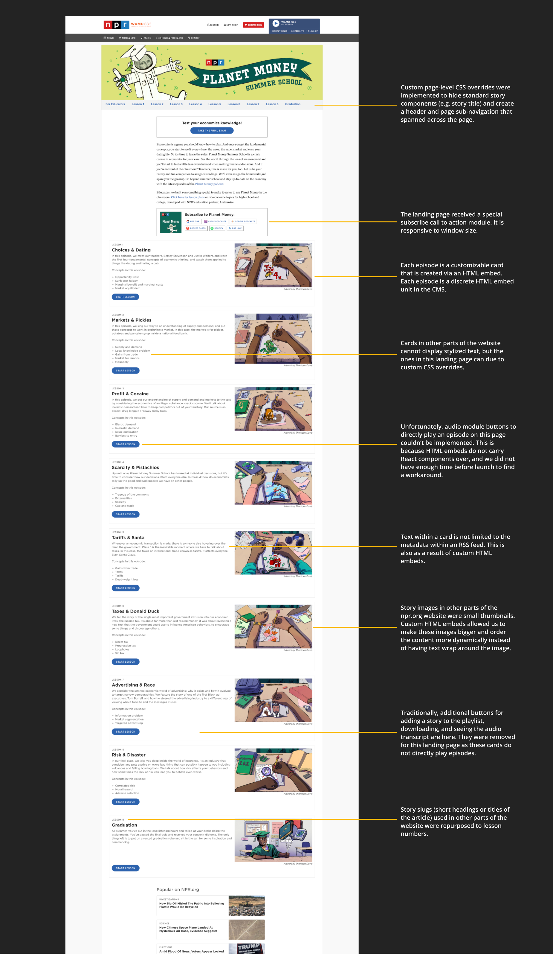
Because this summer series was a special edition of Planet Money episodes, the editorial team wanted a custom landing page design for the series. As such, special HTML embeds and custom CSS overrides were utilized to achieve the landing page designs.

Implementation

This was a project with a very tight turnaround time and was not traditionally scoped and planned in our sprint cycles. One unique thing about working at NPR is that news never stops and the newsroom is a dynamic stakeholder to work with. Ideas that were didn't exist a week ago, can be greenlit and approved for production in a matter of days. So, I learned how to quickly adapt to changing priorities and balance working on my original project and this smaller project.


Check out my other work!

Cover photo for ATM V2 project

ATM V1

PRODUCT DESIGN & USER RESEARCH

Building a standalone tool for NPR podcast producers to tag their episodes for sponsorship messages.

Cover photo for Feed Ingest Service Discovery project

Feed Ingest Service Product Discovery

RESERACH & SERVICE DESIGN

Driving a discovery initiative to define how NPR manages third-party and local station podcasts for NPR platforms.

Cover photo for Podcasters NPR Dashboard project

Podcasters NPR Dashboard

PRODUCT DESIGN

Creating the internal, admin version of NPR's third-party and local station podcast management tool.