Get on My Frequency Interactive Exhibit
THE BACKGROUND

Creating a multisensory, interactive exhibit for the Birch Aquarium at Scripps from idea to floor-ready exhibit.

In the summer of 2018, an undergraduate program partnered with the Birch Aquarium at Scripps for a team of undergraduate students with design, software, and mechanical backgrounds to come up with and build an exhibit for the aquarium within 10 weeks.

THE TEAM

I worked on a multidisciplinary team of nine undergraduates and two university staff advisors. There were three subteams: UX, software, and hardware, each with three members.

THE METHODOLOGY & TOOLS

I was the UX team lead, where I lead the full team in the human-centered design process and the UX subteam in creating and refining the experience of the exhibit. We utilized rapid prototyping, user testing, workflow design methods throughout the project.

The Problem & Opportunity

Museums, zoos, and aquariums are prime locations for learning about history, art, science, and more. I was a part of a multidisciplinary team of mechanical engineers, computer scientists, and visual artists. We were tasked to design and fabricate an interactive, multisensory exhibit about waves for the Birch Aquarium at Scripps in La Jolla, California. I was the UX Team leader, in charge of all aspects of exhibit design.

Our Client & Our Users

After a kickoff meeting with Birch Aquarium, we narrowed and identified our stakeholder objectives. These were then used as guideline and metrics for any exhibit that we create.

Birch Aquarium at Scripps

  • Connect with the greater UC San Diego campus community
  • Communicate Scripps Institution of Oceanography research
  • Create an engaging, interactive, and new guest experience
  • Teach guests about the science of waves

Aquarium Guests

  • Understand the science of waves and its relevance to everyday life
  • Learn through physical and social interaction
  • Accessible for a family of all ages, education levels, and sensory abilities
  • Have an inspiring, educational, and fun aquarium visit

Exhibit Requirements

We then took these objectives and then created the exhibit needs and requirements. In order to create an exhibit that satisfied both our stakeholder objectives, all these concepts needed to be fulfilled.

Requirements

  • Durable for at least 3 years after installation
  • Can be designed and built within 7 weeks
  • Interactive hotspots less than 4ft apart
  • Have a striking visual component
  • Includes sound and tactile experiences
  • Inclusive and safe for all ages
  • Accommodates for all disabilities

Needs

  • Fun and educational
  • Attention grabbing
  • Show cause & effect
  • Make wave physics intuitive
  • Inspire young scientists
  • Promote critical thinking
  • Relate science to everyday life

Rapid Ideation

The exhibit started as a exploratory design process, exploring different aspects about waves. We physically explored physical waves, we used bottom-up/experience-based and top-down/concept-driven rapid design techniques. We created very simple prototypes that played with different wave phenomena.
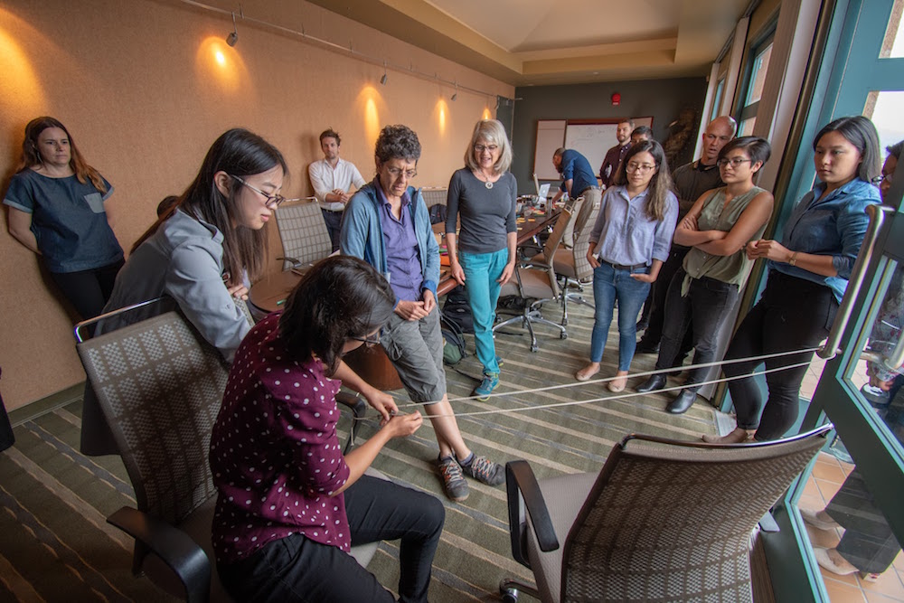
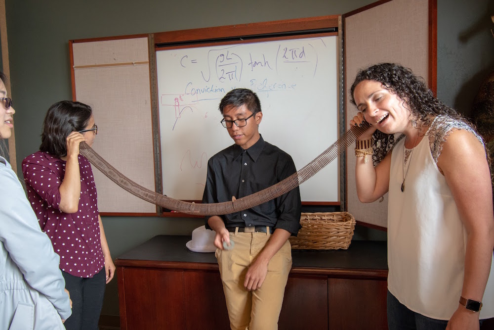
We also created soundscapes of the aquarium to understand the space we were designing for. For example, some spaces are louder, which may take away from the exhibit's sound component. We then went to the drawing board to frame our design challenge with "How might we..." questions. How might we make the science of waves accessible to everyone? How might we integrate visual, audio, and tactile senses? How might we inspire new scientists?
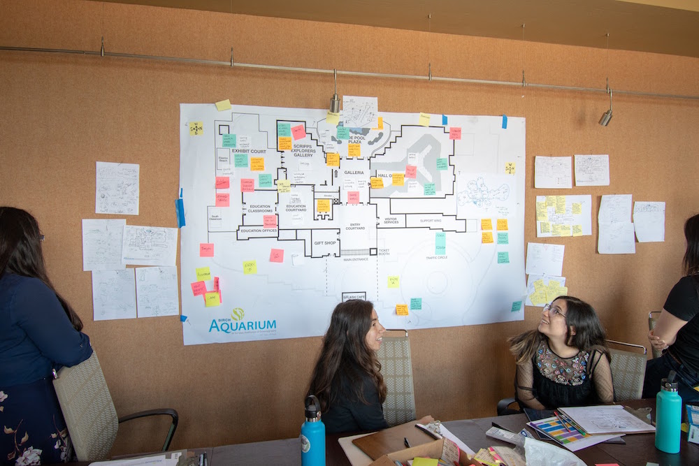
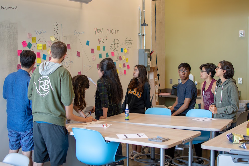
We then went to generate as many possible exhibit ideas as we could. We generated 27 concepts, and 20 were made into proof of concepts. These all demonstrated some wave phenomena and would fulfill the basic requirement of the exhibit. The 20 proof-of-concepts were then downselected to 7 based on several critera: need for maintenance, facilitation of social interaction and/or physical exploration, and feasibility with time and money constraints. After a couple rounds of downselection, Birch Aquarium chose a wave-matching game.
Low-fidelity Prototyping & Usability Testing

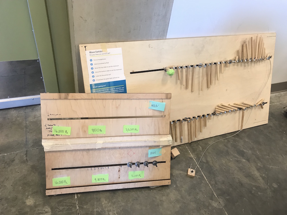
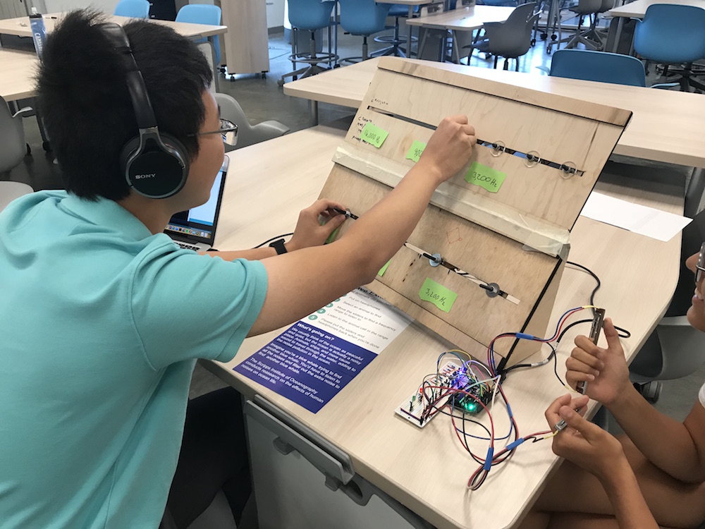
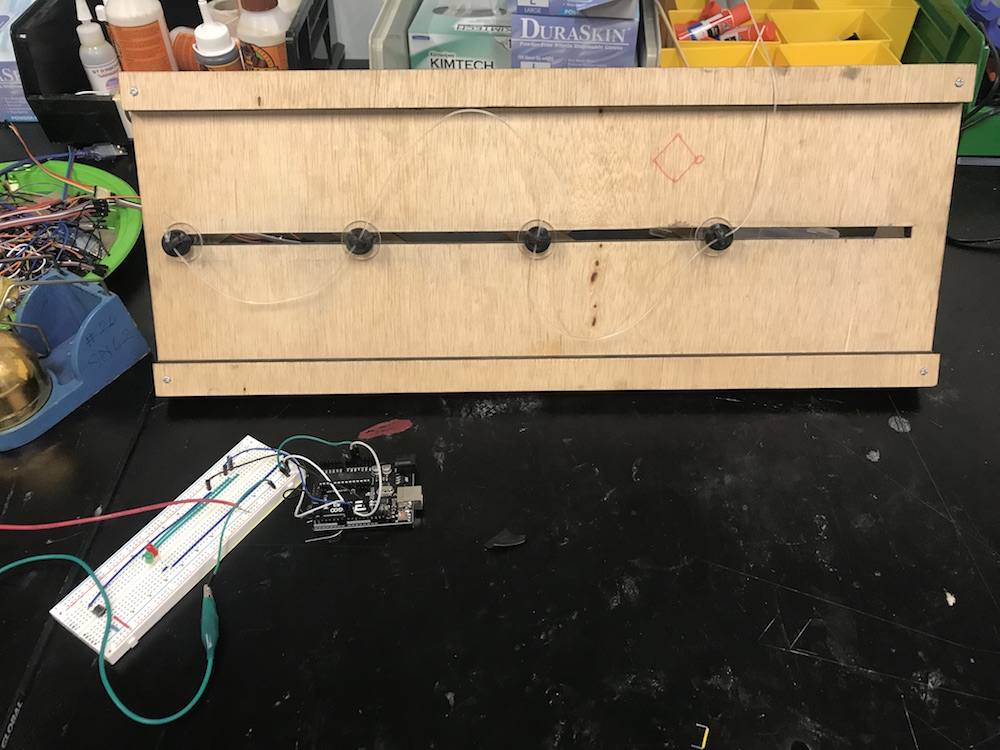
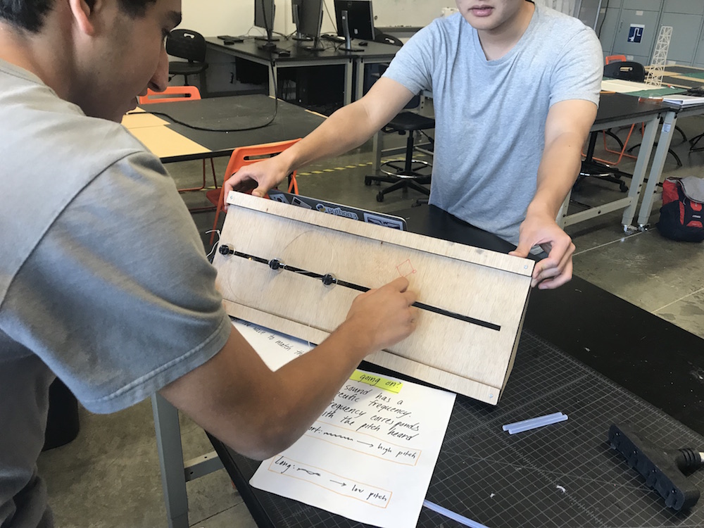
We created low-fidelity prototypes of the wave matching game. This game was meant to teach guests about the wave property of frequency. There is a reference tone that plays, and the guest tries to match the reference tone with tone that is controlled by the board. The guest interacts with the exhibit by sliding a knob on the board left and right. As the knob is slid to the left, then the waveform compresses, and the sound that the guest hears is a high frequency tone. As the knob is slid to the right, then the waveform expands, and the guest hears a low frequency tone.

Exhibit Invites Interaction

As participants were playing with the prototype, even before they knew exactly what they were supposed to do. As they played, by moving the slider, they began to unpack the game, purpose, and goal of the exhibit. Once they understood, they wanted to play more.

The Science is There

We asked pre- and post- questions to see if our exhibit successfully communicated the frequency wave science concept. For those who were not clear on what frequency was, playing with the exhibit helped explain the concept in an easy to digest way.

Pivot

However, the sound matching frequency game did not particularly reflect any of the research being done at the Scripps Institution of Oceanography. As a result, the exhibit concept and design was pivoted to include some form of research into our exhibit.

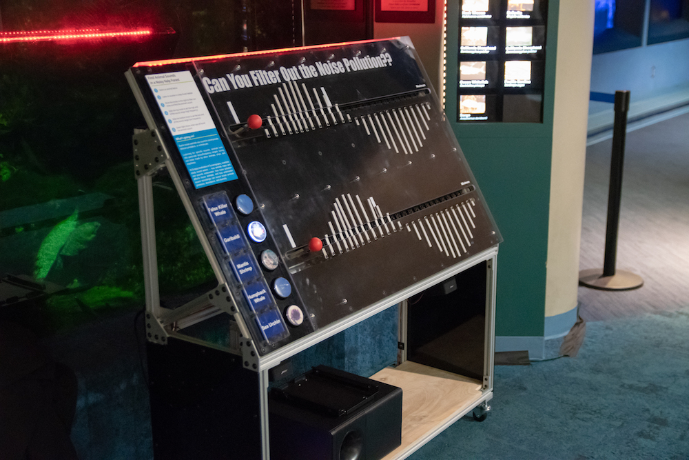
Thus, the exhibit concept pivoted from a sound matching game about a single frequency tone to a noise pollution filtering game. Noise pollution is a major problem that marine animals face. They must tune into a frequency range to distinguish meaningful signals (i.e. other animals) from noise (i.e. ship engines). This exhibit concept still utilizes frequency as the method for signaling sound frequency ranges to listen to.

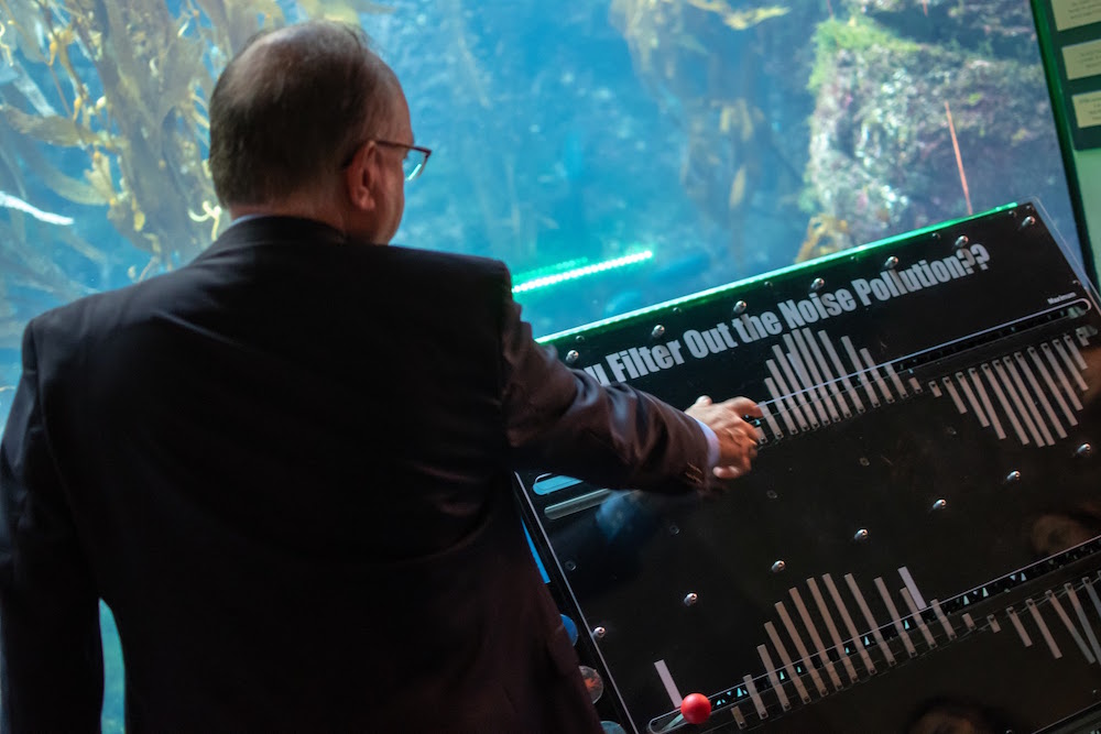
When the exhibit is at its orginal baseline, all the sounds of the ocean play. Fish and whale calls to ship engine sounds all play at once. As the guest interacts with the exhibit to narrow down to specific frequency ranges, the sounds that a guest hears dynamically changes to reflect the position of the sliders.

Mid-Fidelity Prototyping & Usability Testing

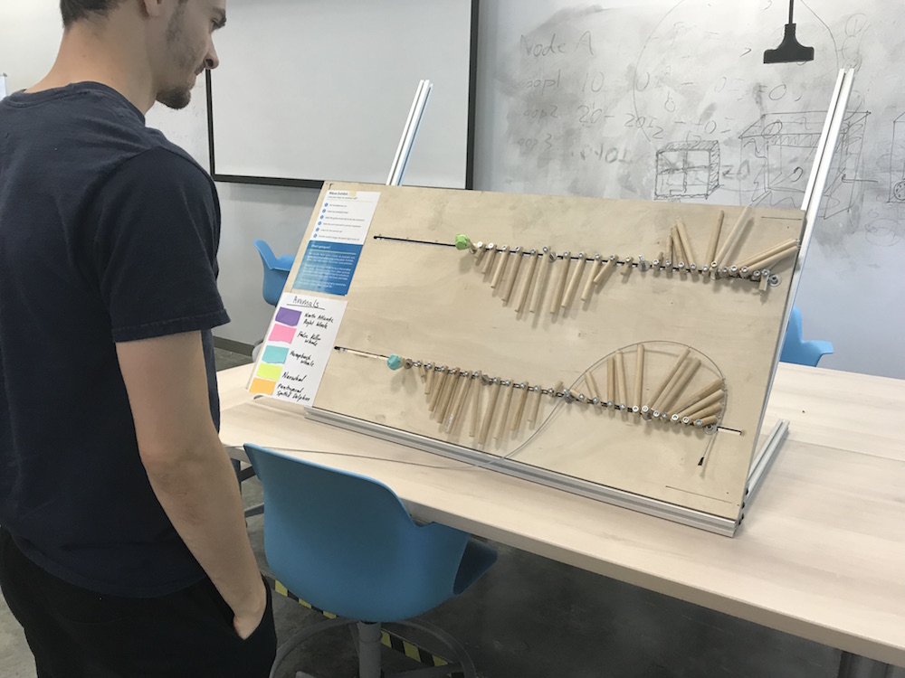
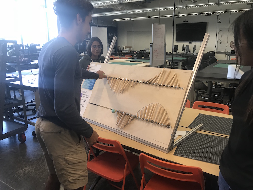
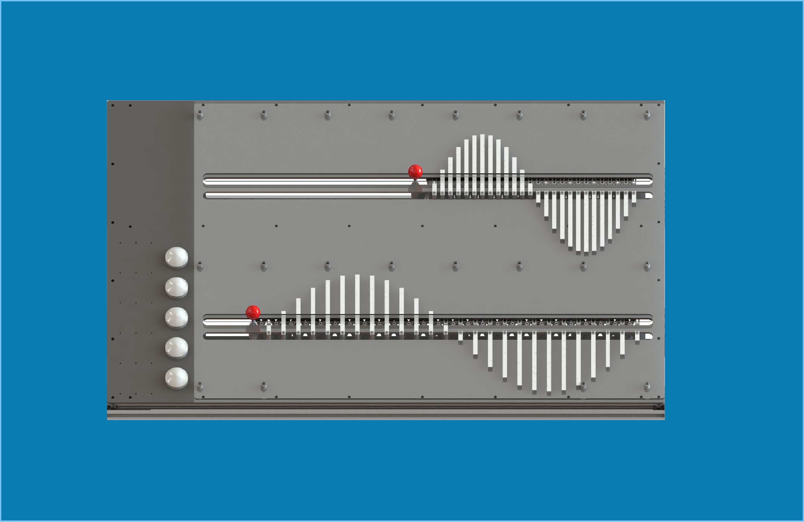
With the new concept, a mid-fidelity prototype was built and tested. There are two levels of sliders in order to create the frequency range that guests listen to. The top slider represents the maximum of the range, or the high frequency range. The bottom slider represents the minimum of the range, or the low frequency range. Additionally, both sliders had a waveform shape comprised of vertical bars. These waveforms reflect the shape of a high frequency sound (compressed shape on the top slider) and a low frequency sound (expanded shape on the bottom slider).

The New Game is Fun!

Hearing animal call sounds was interesting and engaging. The gameplay was understandable and participants were able hear dynamically changing animal sounds based on their positioning of the sliders. People liked playing the game!

Two Slider Mechanism is Ok

We were concerned that having 2 sliders, particularly ones that move to the left, would be confusing. However, all participants were unfazed by it and opted to just play with the exhbit and figure out what they were for through play.

Floor Ready Exhibit

In order to create a floor-ready exhibit by the end of 10 weeks, many rounds of usability testing was performed on all aspects of the exhibit design. We performed testing from the game play software, the number of bars to make a waveform, the number of buttons to place, to the instructional panel. The results of usability testing informed the design decisions that were then reflected in the 3D Solidworks renderings of the exhibit. The renderings were used to build the final exhibit.

Reflection

The biggest challenge during this internship was working in an interdisciplinary team. We all came from different backgrounds, so communicating with each other was a constant battle for us. I had to learn how to both talk to and listen to other team members. While it sounds simple enough, I found that we would often hear what we wanted to hear, or simply not entirely understand what the other person was saying. This led to quite a few miscommunication problems and key decisions were left unaddressed or unimplemented. Communication is not just telling someone something. It is understanding why something was being said, comprehending what was said, being able to have a discussion about it, and transforming words into action.

Additionally, because I was the only member who had experience with UX, I had the opportunity to teach other team members about the human-centered design process. It was a unique opportunity to teach others about how to create detailed interaction flows, conduct usability testing sessions, and think from the user's point of view. This made me a better designer because it made me more cognizant of what kind of designer I was and how I communicated design decisions to other people, especially those who do not come from the same background as me.


Check out my other work!

Cover photo for Podcasters NPR Dashboard project

ATM V1

PRODUCT DESIGN & USER RESERACH

Building a standalone tool for NPR podcasdt producers to tag theri episodes for sponsorship messages.

Cover photo for ATM V2 project

ATM V2

PRODUCT DESIGN

Updating ATM to automatically update baked-in sponsorship to dynamic sponsorship.

Cover photo for Feed Ingest Service Discovery project

Feed Ingest Service Product Discovery

RESERACH & SERVICE DESIGN

Driving a discovery initiative to define how NPR manages third-party and local station podcasts for NPR platforms.